To decorate our atelier at school we were asked to design a curtain about graphic design. I found out about the word Zwiebelfisch in my research about the language we use in graphic design. This word is't used anymore but was used when they still used those lead letters. When one of those letters was placed with the wrong font they called it a Zwiebelfisch (mostly because of the lead letters looking like little fishes) but these mistakes came unnoticed in the text and were only seen when it was pressed on paper. I tried to translate to our new way of making mistakes. So what you see is simply the word, but there is one tiny difference that can only be seen by someone who is used to seeing different fonts. (Find the mistake! The solution is beneath the pictures.)
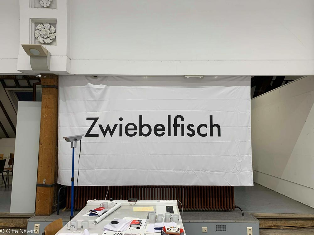
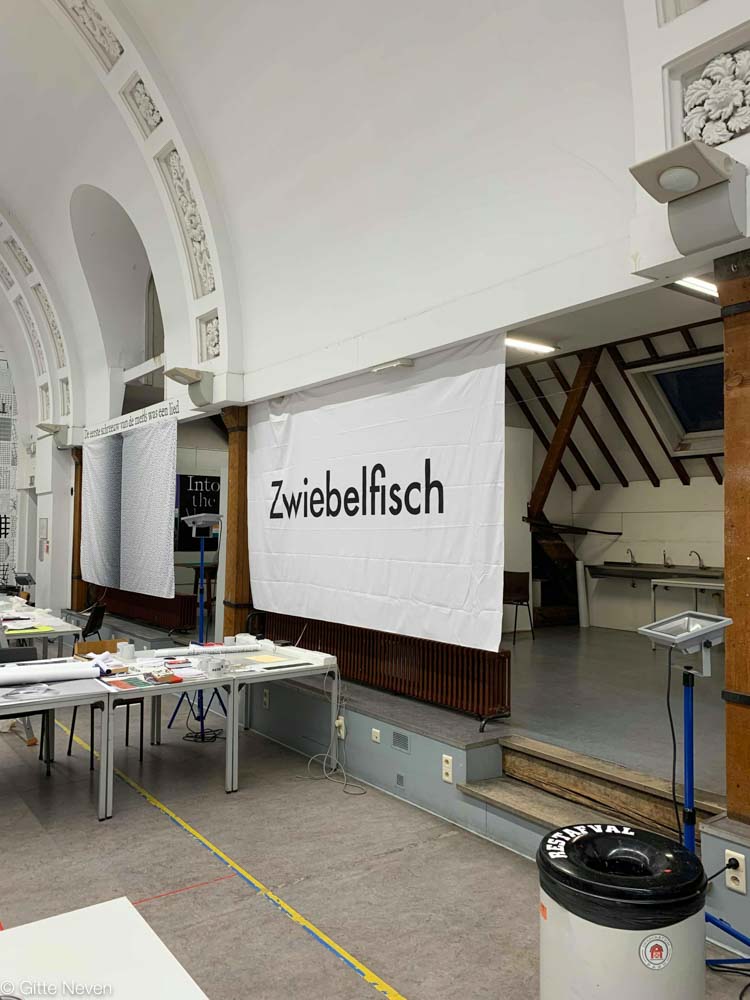
There are 2 different 'e's'. One is Futura and one is Helvetica!